Monday 23 March 2015

Process of creating my magazine cover

The first thing I did when creating my magazine cover was create a black background using the rectangle tool. I then labelled that layer 'background' and locked it. I imported the same picture from my poster into here and scaled it to the size and position I wanted it.
I used two text boxes to create my masthead. I rasterised the text box layers so it was easier to scale and position the masthead. Also by doing this, I could merge the two layers together to move them both around easier. 

One convention of magazine covers are barcodes, as they are very important to keep track of various things such as how many issues are sold etc. I copied and pasted this barcode from google images and then scaled it to this size using the free transform tool. I then used the rectangle tool to create a white box behind the barcode so the date and price are visible. This makes it look more professional and like a real cover.
Plugs are conventions of film magazines, and so I made one by using the ellipse tool and text boxes. To make the red outline circle, I used the ellipse tool to make a solid circle, as labelled 'Ellipse 1' on the layers tab. To give the illusion of it being just a ring, I created another solid circle, however it is black and slightly smaller. I then used text boxes and different sized fonts to write the text out. Finally, I selected all 5 layers, rasterised them, then merged them together so I can move them around easier.

Magazine Cover draft 1


Wednesday 18 March 2015

Process of creating my blu ray cover

I began my cover by downloading a template from a website and opening it in photoshop. This template had preset guides for me to follow which made the whole process a lot easier and quicker. I used the rectangle tool to create the black background first.
Next I copied the same image from my poster, onto the cover as I want to establish continuity across my products. I just had to resize it as it was rather large when I pasted it into photoshop. I then had to write my title so I used a text box for this and also used the same font and colour as on my poster. I then went onto google images and searched for both the BBFC and Irish Film Classification 15 rating logos, and copied and pasted them onto the cover. I had to use the magic wand tool to remove white backgrounds. These two logos add a great deal of realism to the poster as it is a convention of blu ray/DVD covers.
I wrote the names of my two stars at the top of the cover, as they are on my poster, but instead I changed the colour of the surnames to red as I wanted this cover to have a bit more colour than my poster because blu ray/DVD covers often do this. I feel like doing this makes it look more professional and sophisticated. I also added 'A Nick Richardson Film' above the title because this is how it is on my poster and I wanted to have my name on the cover as this is also a convention of home video covers. I, again, used a text box to do this.
Covers often have review quotes/star scores on them so I made this one up from the Sunday Times. To do this, I found a grey star on google images, copied and pasted it into photoshop, then duplicated it three times so I have four stars. I then scaled it down to the current size and used a text box to name the publication.
I duplicated the text layer from the front, turned it 90 degrees clockwise, scaled it down, and placed it on the spine so it has the title there, as is the norm for covers. I then duplicated the rating layers and scaled them down to the current size and placed them in the conventional place on the spine. I also used the Wyke logo form my poster, and copied the Warner Bros logo from google images to add realism to it. I again had to use the magic wand tool to remove the white background from the Warner Bros logo. 
Here, I recreated the rating labels that are commonly found on the backs of cover, using the rectangle tool, text boxes, and by duplicating the ratings again. The fonts I have used look very similar to the actual fonts used and makes it look even more real.
I copied and pasted all of these logos from google images, I just needed to scale them down and place them when I pasted them into photoshop. I used a text again to write the approximate running time on the back. These logos are all commonly found in this area of a blu ray cover.
For the credits, I rasterised and merged the text layers on my poster, then copied and pasted them onto my cover. I then scaled down the layer to an appropriate size and placed it in its current position, which is where the credits are normally found. I also created some more ratings as they are also commonly found on the back of covers. To do this, I duplicated the grey stars from the front. I then used the magic wand tool to select the grey area, and then I filled them in, in red. I then duplicated these layers and placed then like so. To write the names of the reviewers, I used a text box and italics.
Covers tend to have screenshots of the actual videos on the back, so I went through my film and picked some of the best shots, and shots that tease some of the story, and imported them into photoshop. I scaled them down so I could fit three in a row on the back. I then used the rectangle tool to create the white boxes around the pictures. These boxes make the pictures stand out and add some professionalism to it.
A synopsis of the story is very important on a cover as it is ultimately one of the main things that helps sell the blu ray. To do this I again used a text box, as is evidenced above. I used the font Helvetica Light as this is a simple yet appropriate looking font and resembles something we would see on a real cover. 
For the specifications box, I used the rectangle tool again to create the lines. I lined them up perfectly with each other to create the box. I merged all of the individual lines together so I could scale and move the box much easier as they all do this together on one layer. I used the specifications format used on many covers, as well as the type of text that is written, such as the video resolution, audio types, and subtitles. I used text boxes to do all of these.

Finished product:

Process of creating my poster

I began my poster my creating a new file, with the canvas size as an A4 sheet. I then used the rectangle tool to create the black background.
I then imported a screenshot from my film to use for the main image. I chose this image specifically because I really like the high key lighting and silhouette effect this creates. This kind of image is common within the thriller genre as it gives it a sense of mystery and the audience perhaps may find it hard to tell exactly what it is - unanswered questions, which is a convention of thrillers. To get the audience to focus just on the outline of the face, I had to get rid of the light from the rest of the image, so to do that I used the polygonal lasso tool to select the parts I didn't want, and then I filled it in so it is all black around the outline. Then to soften this part I created a vignette by using the elliptical marquee tool and then selecting the inside area of the vignette, then using the gradient tool to create the actual vignette. Although it is not clearly visible where the vignette actually is, it blocks out some other parts of the original image so the audience's attention is solely on the outline of the face and it enhances the silhouette effect further.
The credits are very important for creating a professional looking poster so I had to use the correct looking font. I searched google for the correct font and it is called SteelTongs. To create the credits I simply used text boxes and placed them in a conventional way. I used a variety of job titles for it from the obvious 'Written and Directed by' to 'Weapons Consultant'.
The title, tagline, and release date were all created by text boxes too, however I have obviously used different sizes, colours, and fonts. For the title I have used the font Myriad Pro in white and spaced out the lettering as this is often done in thriller movie titles. For the tagline and date, I have used the font Couture Bold in red. I have used red because it is commonly associated with danger and is often used in thriller movies. 
I imported these logos from google images and they all had white backgrounds on. To remove the backgrounds, I used the magic wand tool to select the white, then pressed delete. This removed it leaving just the logo. I then resized the images to fit at the bottom, as is conventional.

Movie Poster Final Draft


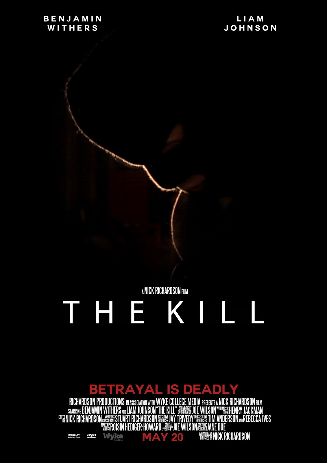
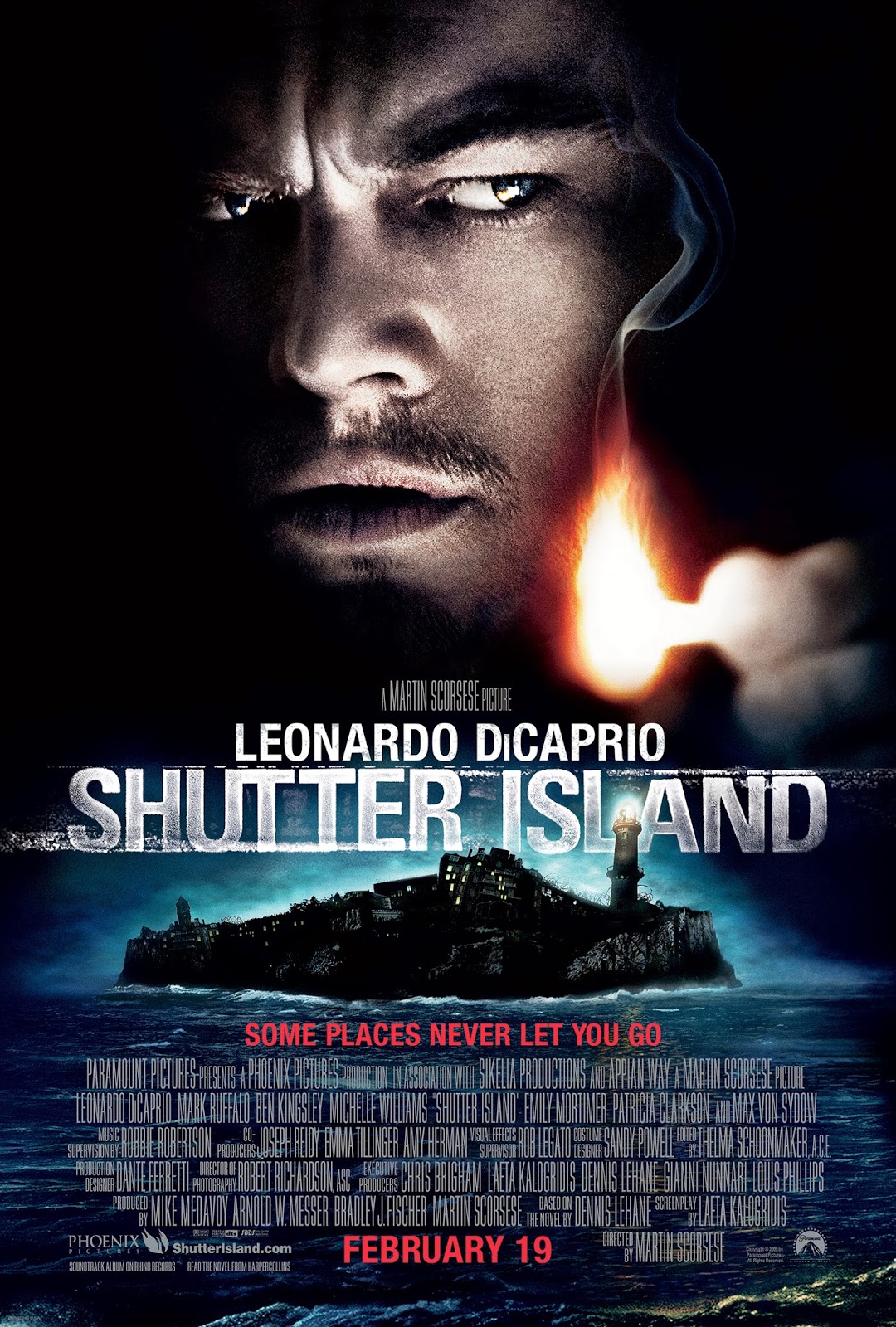
This is my final film poster. I am very happy with how it has turned out as I think it looks very professional and like a real poster. I have used the conventions of film poster to good effect, such as the credits, tagline, main image etc. I used features of many different poster but my main inspiration came from Shutter Island. I used the low key lighting aspect of the Shutter Island poster on my image because I liked the mystery it created. Also, low key lighting is a convention of the thriller genre, and I have used this cinematography technique in my actual film - this creates continuity across my products. 


The colour red has connotations of danger, which is why I have used this colour for the surnames of my actors, the date, and the tagline. By using a housestyle of only three colours, I am keeping my poster simple, which is often what works best for posters from the same genre.


I have added my poster to the iTunes top 10 movie chart, and also put it on a bus shelter advertising board:


This shows how my poster would look if it were to be actually released and reach number 3 in the iTunes charts. By doing this, I am applying my fake media text to the real world to see how it looks and if it actually fits in/looks real. I have also photoshopped it onto a bus shelter to see how it works on real advertising boards. This has helped me see how successful I have been in producing a poster because I can see that it looks professional and real.

Feedback


Blu Ray Cover - Final Draft

This is the final draft of my Blu Ray cover. I feel that this cover is finished because I have used the conventions of Blu Ray covers effectively, such as the BBFC rating, review quotes, title, star names, credits on the back, synopsis, spefication info, and shots of the actual film. By using these conventions, I have created a realistic looking product that advertises my film well and has continuity in that I have used the same main image on this as I have on my film poster, and I have used the same font types and colours.

Upon completion of this product, I printed it out on glossy photo paper and inserted it into an actual blu ray case:


Here you can see how it would look if it released as an actual Blu Ray product - both front, back, and side. The bottom picture shows the case in my actual blu ray collection. As you can see, looks very realistic and does not look out of place in my collection which means I have been successful in creating this product.
I have also photoshopped my cover onto an amazon page. This enables me to see how it would look if it were to be actually released as a product. 

Sunday 1 March 2015

Raw Footage

During filming I did many takes of different shots and altogether I have 128 different takes which amounts to 27 minutes of footage, of which I only need 5 minutes. This is good because I have a lot of footage to choose from. I also did some variations of a particular shot and I will choose which one works best in the edit. 

Here is a screenshot of all raw footage in a folder:

Filming diary