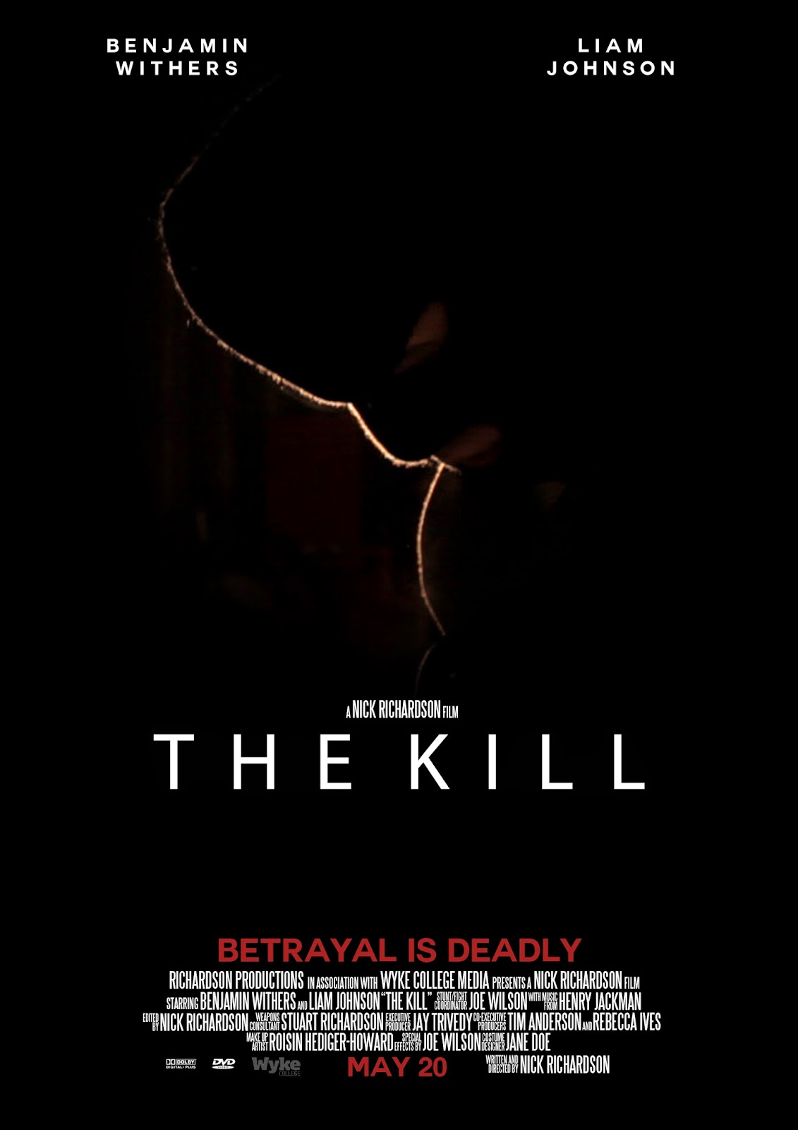
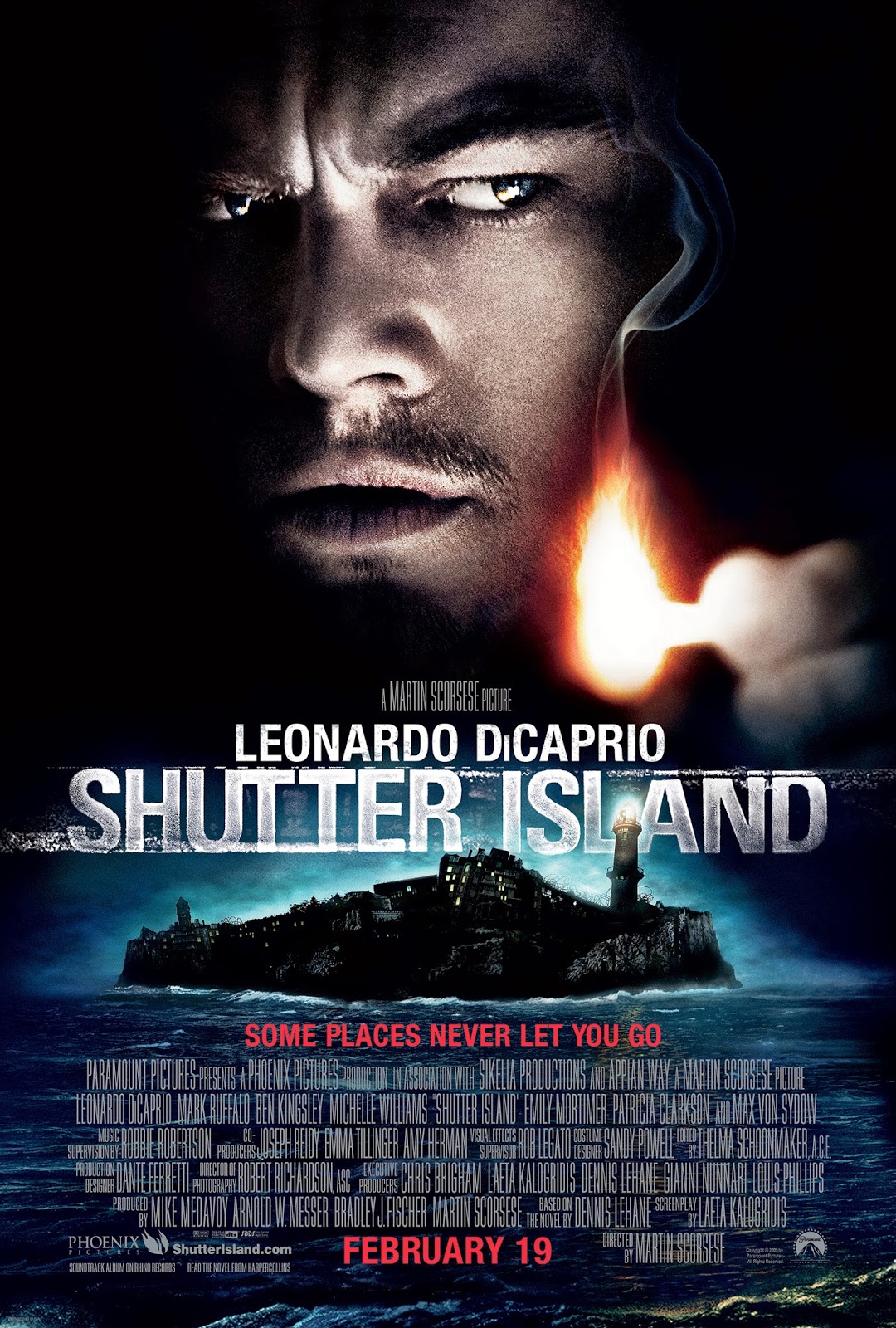
This is my final film poster. I am very happy with how it has turned out as I think it looks very professional and like a real poster. I have used the conventions of film poster to good effect, such as the credits, tagline, main image etc. I used features of many different poster but my main inspiration came from Shutter Island. I used the low key lighting aspect of the Shutter Island poster on my image because I liked the mystery it created. Also, low key lighting is a convention of the thriller genre, and I have used this cinematography technique in my actual film - this creates continuity across my products.

The colour red has connotations of danger, which is why I have used this colour for the surnames of my actors, the date, and the tagline. By using a housestyle of only three colours, I am keeping my poster simple, which is often what works best for posters from the same genre.
I have added my poster to the iTunes top 10 movie chart, and also put it on a bus shelter advertising board:
This shows how my poster would look if it were to be actually released and reach number 3 in the iTunes charts. By doing this, I am applying my fake media text to the real world to see how it looks and if it actually fits in/looks real. I have also photoshopped it onto a bus shelter to see how it works on real advertising boards. This has helped me see how successful I have been in producing a poster because I can see that it looks professional and real.


No comments:
Post a Comment